Mobility Experiences
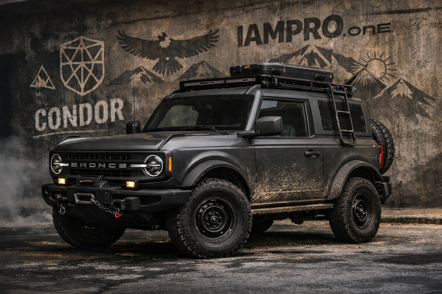
Bronco Experience
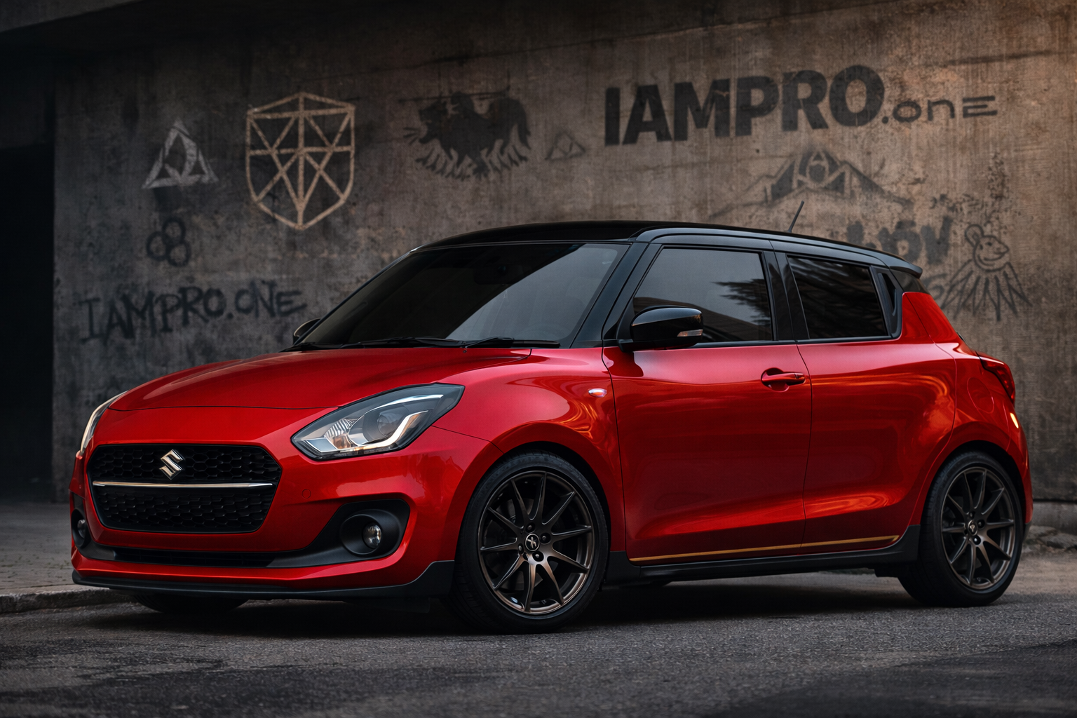
Swift City Ride
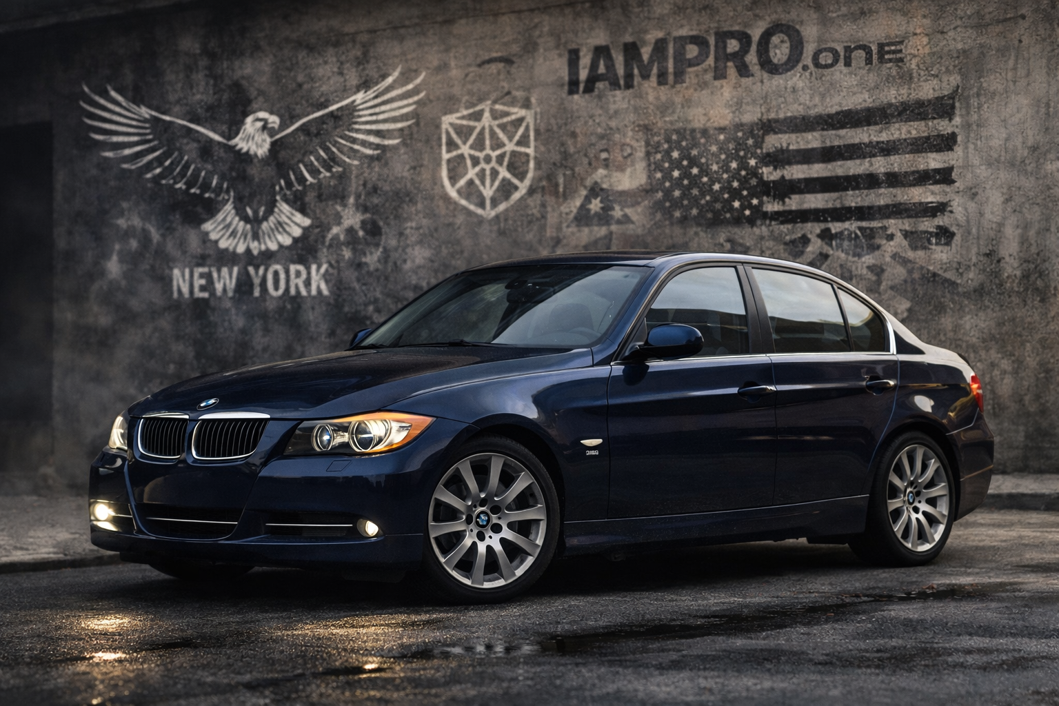
BMW Executive
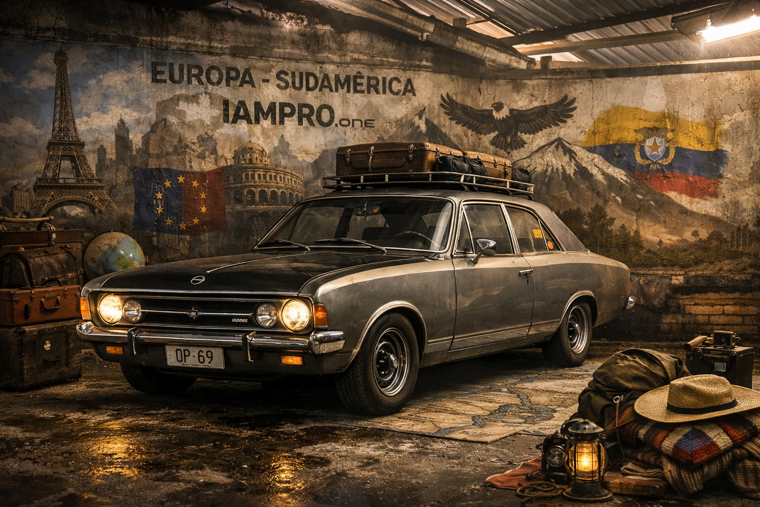
Opel Heritage
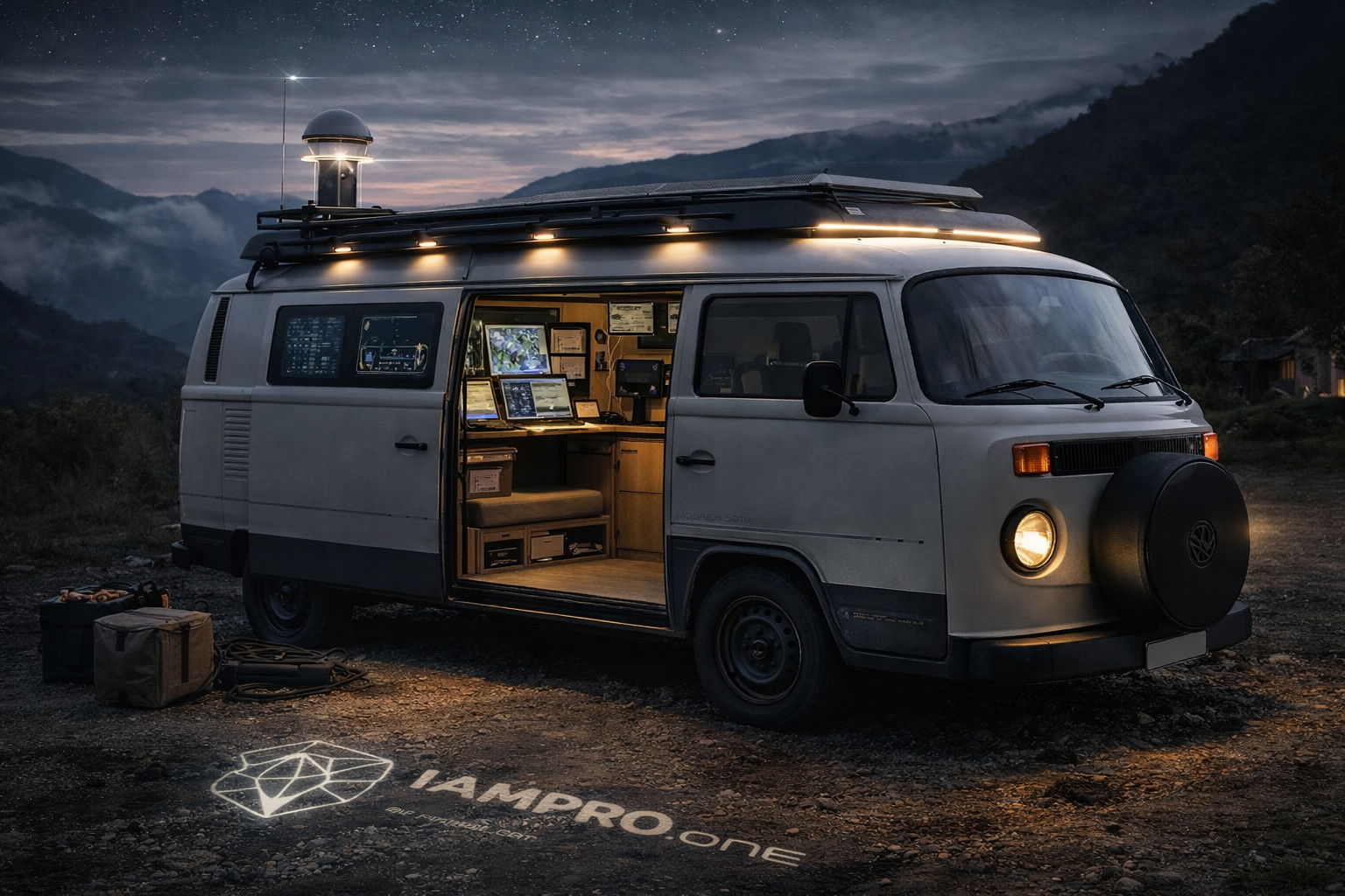
Field Van
VEHICLE DESIGN METHOD
(IAMPRO.ONE Mobility Identity System)
Each vehicle was NOT styled randomly.
Each one followed the same 5–layer framework:
1. ROLE FIRST (NOT LOOK)
Before touching aesthetics, define:
| Vehicle | Role |
|---|---|
| Swift | Urban Connector |
| Bronco | Terrain Explorer |
| BMW | Power / Legacy |
| Opel | Memory / Heritage |
| Van | System Node |
Design comes from function + narrative, not taste.
Ask:
→ Is this for arrival?
→ Exploration?
→ Presence?
→ Story?
→ Utility?
2. PERSONALITY AXIS
Each vehicle sits between:
Luxury ←→ Utility
Nature ←→ Technology
Silence ←→ Presence
Example:
Swift = Light Presence
Bronco = Commanding Nature
BMW = Precision Power
Opel = Timeless Memory
Van = Intelligent Service
This defines styling restraint.
3. VISUAL LANGUAGE RULES
All vehicles followed these shared design principles:
A. Avoid showroom gloss
Matte / satin / muted finishes feel intentional.
B. Duality
Every vehicle carries:
→ Earth element
→ Signal element
Example:
Swift:
- Earth = Red body
- Signal = Black roof
Bronco:
- Earth = Raw terrain stance
- Signal = Clean geometry accents
BMW:
- Earth = Deep navy history
- Signal = Subtle modern sharpness
4. STRUCTURE OF MODS
Every vehicle styling followed:
Layer 1 — Silhouette Control
Do NOT change the car. Accentuate its geometry.
Examples:
Swift → roof contrast
Bronco → stance + shadows
BMW → sharpen lines via contrast
Van → horizontal calmness
Opel → preserve purity
Layer 2 — Contrast Placement
Use contrast only in:
• Roof
• Wheel area
• Lower body
• Mirror accents
Never random.
This creates cohesion across fleet.
Layer 3 — Motion Lines
Instead of decals:
Use visual flow.
Example:
Swift → hood softness
Bronco → mass blocks
BMW → directional tension
Van → horizon alignment
No racing stripes.
No aggression.
Layer 4 — Tone Mapping
Use:
Neutral anchors:
- Black
- Graphite
- Satin metal
Accent tones:
- Deep blue
- Soft bronze
- Earth neutrals
Avoid:
✗ Chrome overload
✗ Bright graphics
✗ Sticker energy
Layer 5 — Symbolic Subtlety
IAMPRO.ONE presence is:
• Environmental • Architectural • Never branded loudly
Use:
- Shadow marks
- Geometry
- Background integration
- Light cues
NOT logos everywhere.
5. STORY INTEGRATION
Each vehicle carries narrative:
| Vehicle | Symbol |
|---|---|
| Swift | Companion |
| Bronco | Condor |
| BMW | Eagle |
| Opel | Archive |
| Van | Bridge |
This affects:
Lighting tone
Environment
Posture
Not decals.
QUICK REPLICATION FORMULA
If styling another vehicle:
Step 1
Define its role.
Step 2
Place it on:
Nature ↔ Tech
Utility ↔ Presence
Step 3
Add only:
• 1 contrast zone
• 1 grounding tone
• 1 signal detail
Stop there.
Restraint = sophistication.
FLEET COHERENCE RULE
Even though each vehicle is unique:
They all share:
→ Calm confidence
→ Functional elegance
→ Non-flashy intelligence
Think:
Explorer, not show-off.
IF YOU EVER WRAP / MODIFY IN REAL LIFE
Give this to a shop:
✔ Matte or satin roof contrast
✔ Wheel tone harmonization
✔ Remove chrome where possible
✔ Keep body color dominant
✔ Add subtle dark lower structure
Avoid full wraps unless storytelling requires.
This is why the fleet feels unified without being identical.